This is really cute! It feels so confidently executed in a raw sort of way that I think works especially for children's illustrations. I would watch the tangents that are happening with the boy on the right. His head hits the horizon line. I would move the horizon up or down a little bit. Also, his scarf gets really close to the right edge. I might just let it run off like you did with the left boy's hat. Another thing to think about is saturation levels. I would grey the sea down a bit at least.
I love the bright, vibrant colors! They work really well with the sunset. However, your background is a little too saturated. Push your atmospheric perspective and dim down the blue ocean water - it fights for attention against your figures. Nice details! I think you could render and detail the dinosaurs a little more though.
This is really fun! Your characters are really cute, and I really like your dinosaurs as the treasure. The color pallet works really well. I agree with Kelsey, I think that the ocean is too saturated and draws attention away from the characters. The other thing that I noticed is the blond boy's left wrist looks a little bit bigger than his arm.
Kim this one is so adorable!! So good!! I would just have to say that the boys faces seem a tad too dark. It just doesn't seem like realistic lighting. But I love the composition and I love the dinos!!
Good shtuff. Just remember what Big Daddy Helquist said. He's awesome. Also maybe have the sword be mostly all the same value and hue since it is all in shadow.
I love the warmth in this piece, both subject matter and color choice. The love you have for what you are painting is coming through. It just looks like it could have a more finished look, like it needs a little bit more polish. But you are going to be a great children's book illustrator!
I really like the colors and lighting here. I think the really big brush strokes work well for the most part, but maybe bring in some variation in brush size to give more detail in the focal points- the kids faces and the dinosaurs could be just a little more defined. Nice work!
I don't think I can say anything better than Bret H. did. Really cute and the composition is great, but I agree about the colors. They just need a little adjustment. And maybe extend the bandana on the boy on the right just a little more. It feels a little close to the edge. Good job!
Oh the nicest time of day and scene. Who doesn't want to look at a beach scene at sunset with kids playing :) It is a really warm fuzzy thing to look at. Great mood. One thing is both boys seem a little distant - maybe if they were somehow making eye contact or just one was looking at the other...some sort of interaction...it would feel more like the viewer was peeking into a really sweet scene of childhood/playtime/friendship.
Very adorable! I think one thing you could do is design the island in the top right corner a little more. It seems a little distracting. And the water line where it meets the shore isn't as believable as it could be. I think it could make a more organic shape. But I think you did a really great job!

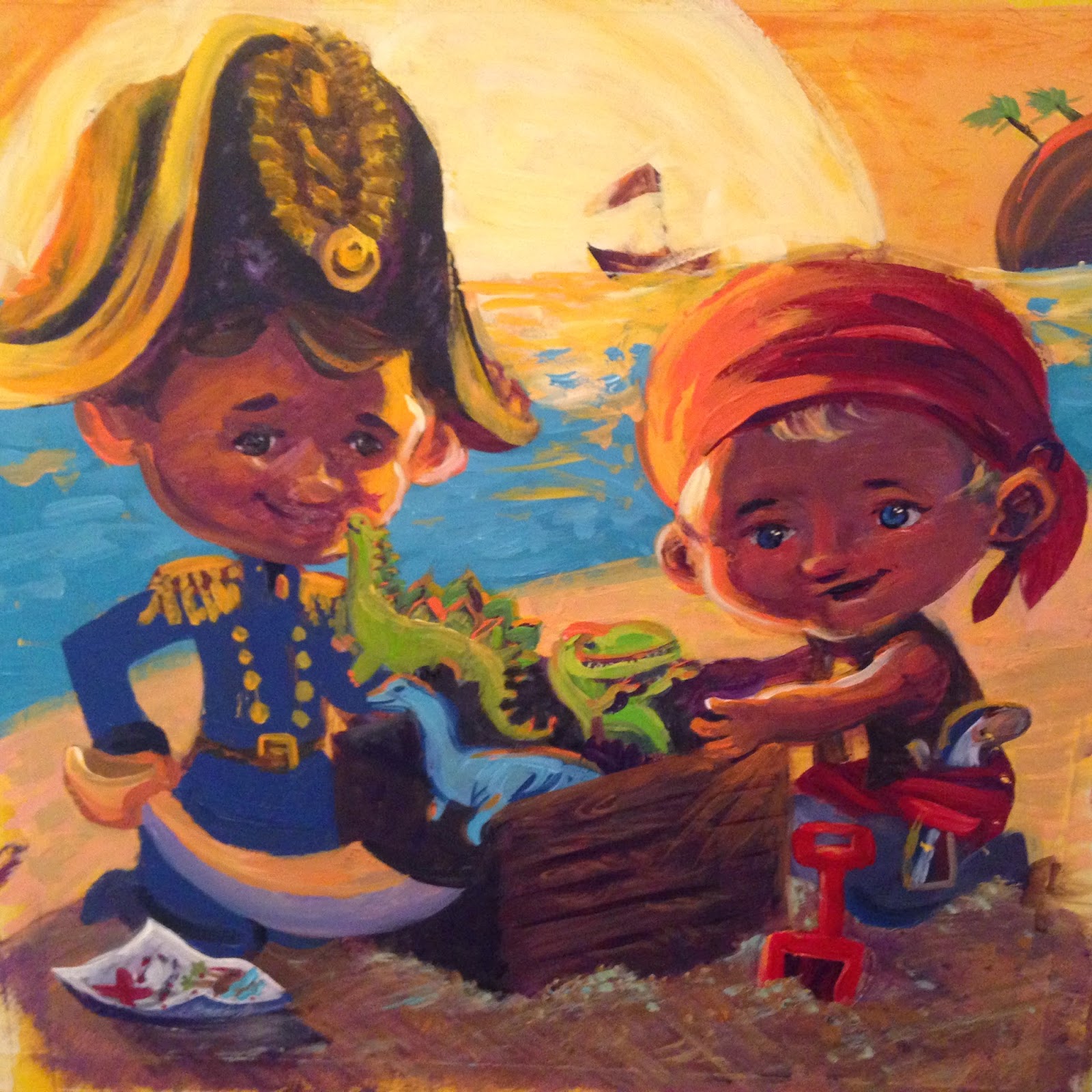

I like the colors, especially the violet of the boys' faces. I think maybe each dinosaur should be a different color.
ReplyDeleteThis is really cute! It feels so confidently executed in a raw sort of way that I think works especially for children's illustrations. I would watch the tangents that are happening with the boy on the right. His head hits the horizon line. I would move the horizon up or down a little bit. Also, his scarf gets really close to the right edge. I might just let it run off like you did with the left boy's hat. Another thing to think about is saturation levels. I would grey the sea down a bit at least.
ReplyDeleteI love the bright, vibrant colors! They work really well with the sunset. However, your background is a little too saturated. Push your atmospheric perspective and dim down the blue ocean water - it fights for attention against your figures. Nice details! I think you could render and detail the dinosaurs a little more though.
ReplyDeleteThanks for your comments everybody!!
ReplyDeleteThis is really fun! Your characters are really cute, and I really like your dinosaurs as the treasure. The color pallet works really well. I agree with Kelsey, I think that the ocean is too saturated and draws attention away from the characters. The other thing that I noticed is the blond boy's left wrist looks a little bit bigger than his arm.
ReplyDeleteKim this one is so adorable!! So good!! I would just have to say that the boys faces seem a tad too dark. It just doesn't seem like realistic lighting. But I love the composition and I love the dinos!!
ReplyDeleteGood shtuff. Just remember what Big Daddy Helquist said. He's awesome. Also maybe have the sword be mostly all the same value and hue since it is all in shadow.
ReplyDeleteI love the warmth in this piece, both subject matter and color choice. The love you have for what you are painting is coming through. It just looks like it could have a more finished look, like it needs a little bit more polish. But you are going to be a great children's book illustrator!
ReplyDeleteI really like the colors and lighting here. I think the really big brush strokes work well for the most part, but maybe bring in some variation in brush size to give more detail in the focal points- the kids faces and the dinosaurs could be just a little more defined. Nice work!
ReplyDeleteReally cute and juvenile style, but I'd agree with others and say play around with colors a little more.
ReplyDeleteI don't think I can say anything better than Bret H. did. Really cute and the composition is great, but I agree about the colors. They just need a little adjustment. And maybe extend the bandana on the boy on the right just a little more. It feels a little close to the edge. Good job!
ReplyDeleteOh the nicest time of day and scene. Who doesn't want to look at a beach scene at sunset with kids playing :) It is a really warm fuzzy thing to look at. Great mood. One thing is both boys seem a little distant - maybe if they were somehow making eye contact or just one was looking at the other...some sort of interaction...it would feel more like the viewer was peeking into a really sweet scene of childhood/playtime/friendship.
ReplyDeleteVery adorable! I think one thing you could do is design the island in the top right corner a little more. It seems a little distracting. And the water line where it meets the shore isn't as believable as it could be. I think it could make a more organic shape. But I think you did a really great job!
ReplyDeleteYour characters are so cute!!! I also like your composition. I would agree with Bret Helquist that over all it's too saturated.
ReplyDelete